One of the weirdest abstract art to have emerged in the 20th century was that of Minimalism, also known as Cool art. Minimalism is an art style where one reduces the figures to their very basic geometric shape. It is known as the most simplistic of all art forms, both in Sculpture and Paintings. The style first came to be in 1960s New York and quickly spread throughout the art world, where it attracted mostly postmodernist artists like Carl Andre and Agnes Martin.
How it All Began
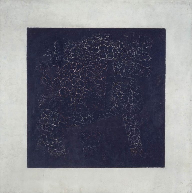
The use of basic geometric forms without any detail as a complete art was first thought to have been derived from Kasimir Malevich’s works and Marcel Duchamp’s ready-mades. Eventually, the movement was pioneered by Josef Albers and Ad Reinhart.
Minimalism, as it turns out, is a reaction to the emotionalism of the established style in the USA at that time, which is Abstract Expressionism. Abstract Expressionism was on a decline around the mid-1950s, so artists are looking elsewhere for new inspirations and art. While Pop Art went on to appeal to the masses with art that’s based on popular media, minimalism stayed true to their surrealist roots. Unlike Pop Art, however, minimalism never did become popular, but instead remained a niche style.
Even around past 2010, minimalism was still appreciated for its aesthetics. From art to home decorating, minimalism’s is best described as “simple, yet beautiful.”
The Aesthetics of Minimalism
In Paintings
Minimalism in paintings is just simple geometric shapes arranged in the way how the object they represent is arranged. A car, driving away from a mountain, for example, can be drawn as a rectangle superseding a triangle. Colours and details are optional. You just have to follow two very simple rules: 1) Simple is best, and 2) Empty spaces are beautiful. Ad Reinhart best described it in his comment about having a simplistic style: “The more stuff in it, the busier the work of art, the worse it is.” “More is less. Less is more,” he added. “The eye is a menace to clear sight. The laying bare of oneself is obscene. Art begins with the getting rid of nature.”
That doesn’t mean you cannot add details. Minimalism is a virtue as well. You just have to keep it simple. A relaxing work with simplistic nature (Ad Reinhart advocates for fewer colours, no colours being the best) and yet understandable.
In Architecture
Modern architecture is also a product of minimalism. Bland-looking buildings and skyscrapers of concrete and glass, shining over the cityscape is an example of minimalism at work. Just like in painting, minimalistic architecture avoids details and meanings. The blander it is to more people, the more beautiful it is to the niche minimalists enthusiasts. The beauty is in the eyes of the beholder, indeed. Concrete is the material of choice, but there’s an example in Japan and in other places that use bamboo or wood. They say that Japan has much to contribute to minimalistic architecture, as traditional Japanese houses have a simple, yet elegant design, inspired by Zen philosophy. The paint job is just one solid colour that can be for a whole wall, a whole room or the whole house.
In Music
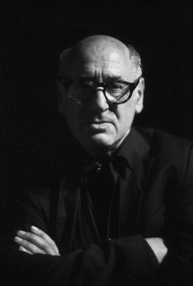
Minimalist music is characterised by simple unadorned rhythms. A repeating steady “pulse of music,” combined with other steady pulses to create a complex repeating combination and yet you can clearly hear either of the two. There can be gradual or no change, it depends, just like how visual minimalism can be devoid of details but doesn’t really prohibit the artist from adding any. It’s just that the smaller the detail the better. The smaller the changes, the better.
Conclusion
Even today there are still a lot of people who appreciate minimalism. There’s a reason the saying “the simpler, the better” still exists. Many might scoff at minimalism and minimalists as lazy, but it isn’t and they aren’t. It’s just that people who appreciate minimalism doesn’t like unnecessary complexities, which just adds noise to what they want to love.
1st Image: Black Square, by Kazimir Malevich. Via Wikipedia.
2nd Image: Michael Nyman, minimalist composer. Via Wikipedia.

