
Our emotions and impressions in minute but important ways are shaped by the fundamentally colored human experience. The spectrum of colors impacts our interactions with the environment from the brilliant hues that motivate us to the somber tones that urge us to stop and think about. Analyzing its emotional impact, cultural relevance, and strategic application in design and branding, this study looks at the numerous functions color serves in general. Knowing the complexities of color helps us to appreciate its ability to communicate messages and interact with others more fundamentally.
The Impact of Color on Emotions
Colors have a big impact on human emotions, which shapes impressions and experiences in many surroundings. While bright colors including red and orange might inspire energy or passion, colder hues including blue and green usually promote calm and tranquilly. Artists and designers specifically use color to elicit specific emotional responses, therefore creating settings that appeal to viewers. A vibrant yellow, for instance, can make one happy; subdued hues could convey sadness or depression. Understanding these psychological effects helps artists to engage their audience on a deeper emotional level and deliver more precisely.
Cultural and Symbolic Meanings of Colors
Many societies have different implications for colors, which influences their use in art and architecture. White, for example, usually represents tranquility and cleanliness in Western civilizations; in other Eastern traditions, it could also represent loss. Red can in many traditions symbolize love and passion; in others, it also suggests danger or warning. Depending on their cultural implications, colors are applied in diverse contexts that affects everything from branding and interior design. Designers and artists have to consider these symbolic connotations to ensure their works appeal to different viewers and convey the desired message.
Color Harmony and Contrast in Design
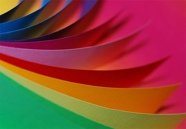
Visual compositions have to find balance largely focusing on color harmony and contrast. While complementary colors—which sit opposite each other on the color wheel—cause dynamic tension and visual attraction, similar colors found next to one another promote togetherness and tranquility. These links are purposefully used by designers to guide the eye of the viewer and generate specific feelings. Good use of contrast helps highlight important elements, therefore enhancing readability. Knowing color interactions enables artists to produce aesthetically beautiful designs that engage viewers and efficiently deliver their intended messages.
The Use of Color in Marketing and Branding
Colors greatly affect consumer impressions and purchase choices. Companies pick colors specifically to evoke specific emotions and connections; blue is a common hue used in financial organizations since it usually conveys dependability and confidence. Among the vivid colors that would generate urgency and motivate consumers to act fast are red and yellow. Consistent color schemes help define brand recognition, therefore enabling the instantly recognizable logos and packaging. Using the psychological impact of color, companies may effectively communicate their ideas and involve their target audience, therefore enhancing brand loyalty and raising market presence.
The way color and emotion interact to dramatically influence our experiences and interactions is a fantastic tool transcending mere aesthetics. Artists may design settings and narratives that actually appeal to viewers by combining the psychological and cultural relevance of colors. This information not only enhances artistic expression but also increases brand identification and consumer interaction, therefore underscoring the important role color plays in many other sectors. Accepting this knowledge helps one to make more intentional and strong design choices that might alter perceptions and build intimate relationships.
Photo Attribution:
1st & featured image by https://www.pexels.com/photo/person-with-body-painting-1209843/
2nd image by https://www.pexels.com/photo/close-up-photography-of-different-type-of-colors-of-paper-40799/
