
Color runs the show before subject matter gets a vote. A viewer can claim to care only about composition or technique, yet the nervous system grabs the palette first, like a hand touching a hot pan. That reflex matters. It explains why a modest poster can feel loud and why a museum canvas can feel like a whisper that hits the chest. Artists know this, even the ones who deny it. Color isn’t decoration. Color acts as a behavioral cue, a memory trigger, a social signal, and sometimes a weapon. The tension sits in the gap between what people say color means and what bodies do when the hue arrives.
Red: The Alarm Bell With a Velvet Glove
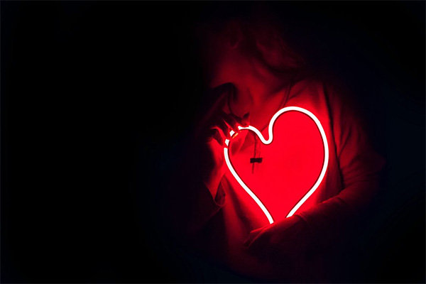
Red doesn’t negotiate. It announces. Blood, ripe fruit, warning lights, lipstick, stop signs. Culture dresses it up with romance, but biology stays stubborn. The eye catches red fast because the brain treats it as urgent information. That urgency can energize a painting even when the scene sits still. Red also shortens patience. Small red accents can steer attention, pushing quick judgments. Red reads as warmth, and warmth reads as closeness. That’s why red can feel intimate and aggressive. Place red against black and the pulse rises.
Blue: Calm, Control, and the Myth of Neutrality
Blue plays the rational voice. People call it calm and trustworthy, then act shocked when a blue painting feels cold. Cool colors can slow perceived time. A blue field can stretch seconds into contemplation, which keeps viewers standing. Yet blue also signals distance. Sky and ocean sit far away, and the brain learns that far-away often equals safe but unreachable. Artists use that trick to make loneliness look elegant. Social baggage clings to blue. Corporate brands bathe in it because it sells steadiness. A bright cyan beside acidic green turns restless.
Yellow and Green: Appetite, Decay, and the Jitters
Yellow behaves like sunlight until it doesn’t. A soft yellow can read as hope, youth, breakfast. Push it brighter and it starts to nag. Too much yellow can irritate because the eye strains under high brightness, and effort becomes feeling. Painters exploit this, making cheer that tips toward anxiety. Green strolls in as nature’s ambassador, then reveals a double life. Green means growth. Green also means mold, bile, jealousy, poison labels, that eerie night-vision glow. Expectation drives the reaction. Naturalistic greens feel restorative. Artificial greens feel wrong. Put sickly green on a face and the viewer reads illness before any story begins.
Context: The Color Isn’t the Color
A single swatch tells almost nothing. Surround it, and the mind starts making deals. The same gray looks blue beside orange and looks warm beside navy. Perception judges relationships, not absolutes. Artists who grasp this stop hunting “the perfect red” and start building systems where each hue pressures the next. Culture joins the argument. White can signal purity in one place and mourning in another. Purple can shout royalty or cheap nightclub lighting. Memory barges in too. A particular teal might recall a childhood bicycle. A burnt orange might recall a hospital waiting room. The painting stays silent. The viewer supplies meanings fast.
Color psychology in art doesn’t behave like a tidy dictionary, and anyone selling it that way sells a fairy tale. Bodies react first, then language hustles to justify the reaction. That sequence explains why people argue about a palette’s “message” while still sharing the same jolt of attention, comfort, or unease. Artists steer that jolt through contrast, saturation, temperature, and placement, then let the viewer’s history do the rest. Reproductions anger painters for a reason. Shift calibration, dull the reds, flatten the darks, and the emotional logic collapses. A painting isn’t only an image. It’s a set of color choices that press on the mind and expose what waits.
Photo Attribution:
1st & featured image by https://www.pexels.com/photo/palette-of-colors-14299950/
2nd image by https://www.pexels.com/photo/heart-shaped-red-neon-signage-887349/
