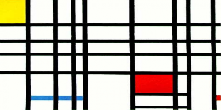
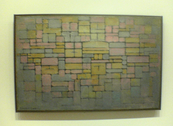
“The emotion of beauty is always obscured by the appearance of the object. Therefore, the object must be eliminated from the picture”
– Piet Mondrian
There are only a few artists whose works have inspired so many other things in modern popular culture. Abstract artist Piet Mondrian’s works, popular for its stark white background, with intersecting black vertical and horizontal lines and some of the resultant squares and rectangles filled with primary colors, have inspired other artists and designers to recreate his style – in wall décor, fabric and fashion, furniture, shoes and bags, and other design forms.
In 1965, celebrated French haute couture designer Yves Saint Laurent was inspired by Piet Mondrian’s Composition with Red Yellow and Blue and created a sack dress in silk crêpe, lined with crêpe-de-Chine that he had donated to the Victoria and Albert Museum in London. Another of the Mondrian-inspired dresses, part of the series from Saint Laurent that became known as the Mondrian Collection, is on display in the Metropolitan Museum of Art in New York City.
The artist
Pieter Cornelis “Piet” Mondriaan, is a Dutch painter born on March 7, 1872. Between 1905 and 1907, he changed the spelling of his name to Mondrian.
Piet Mondrian was one of the founders of the De Stijl, the Dutch modern art movement, together with another Dutch artist, Theo van Doesburg. He is widely recognized for his methodical practice and the purity of his abstract works. Most of his works consisted of lines and basic colors, especially his works starting from the 1920s, which he termed as Neoplasticism. He inspired the development of modern art with his simplified pictorial vocabulary and asymmetrical balance of lines and rectangles and limited palette.
Artistic development
Mondrian’s exposure to art came early as his father taught drawing. He was a nephew of Fritz Mondriaan, a painter who taught his young nephew as well, often taking him on outdoor drawing sessions near the Gein River.
After qualifying as a teacher, he entered Amsterdam’s Academy for Fine Art in 1892. His works from this period were mostly landscapes in Impressionistic or naturalistic style. Most of the scenes were pastoral, showing rivers, fields and windmills, with the style influenced by the Dutch Impressionist (Hague School) initially. He did experiment with other techniques and styles in his search of a more personal style, creating representative paintings influenced by various art movements, including Fauvism in his use of bright colors and pointillism. Some of his works from this period are in The Hague’s Gemeentemuseum, such as Evening (Avond), Trees by the Gein at Moonrise and The Red Mill. Although not yet abstract, his Evening (Avond) painting already showed his use of primary colors.
Abstraction
The abstraction in his paintings showed initially in his works from 1905 to 1908, when objects were almost indistinct, although still steadfastly hinged in nature.
By 1911, his works have already been showing signs of Cubist influence, as he continued to search for simplification. The Gray Tree (1911), found in the Haags Gemeentemuseum, The Hague, was Cubist. He made two versions of Still Life with Ginger Pot. The first version that he did in 1911 was also Cubist in style. The following year, the version was made of rounded shapes with rectangles and squares. Both versions are in the Guggenheim Museum in New York. However, Cubism for him was only a portal to his journey into the world of art, as he continued his spiritual search as well.
Neoplasticism
Late in 1919, when he was back in France, he started creating his grid-based paintings. In his early works in this style, his grid lines were gray, with the tendency to fade as they neared the edges of the canvas. The forms were more numerous and smaller, and most of them were filled with gray, black or the primary colors – red, yellow and blue.
In late 1920, his style changed, with more widely-spaced and thicker black lines for the grid, creating larger and fewer forms. Few forms contained color and most of the painting were left white. By 1921, there were black lines that abruptly stopped before reaching the edge. Most of the closed forms were given color but in the ensuing years, most of the lines extended to the canvas’s edges and more white than color spaces started appearing.
In 1943, his Broadway Boogie-Woogie painting, which is at the Museum of Modern Art in New York, was more complex and had more depth, with more grids, closed forms and colors, although the colors were still primary. Small concentric circles were also included in this particular painting. Most of the works he did in New York were livelier, influenced by the city’s frenetic lifestyle and its upbeat music.
Photo Attribution:
Featured and 1st image by https://www.flickr.com/photos/uhuru1701/ / CC 2.0
2nd image by https://www.flickr.com/photos/Elly Jonez/ / CC 2.0

