
Most people stand in front of a glamorous old building or a swirling iron gate and just think, “pretty.” A trained eye notices something else: a quiet argument between two design philosophies. One loves curves; the other worships lines. One dreams about nature; the other bets on machines and speed. This clash shaped everything from subway entrances to skyscrapers, perfume bottles to movie theaters. Learning to separate these siblings clears up confusion fast. It turns vague impressions into clear patterns and turns casual wandering into something closer to forensic work for design nerds.
Lines vs. Curves
The fastest way to sort the two styles? Watch the lines. Art Nouveau bends. It twists. It stretches into long, whiplash curves that feel almost liquid. Think vines crawling up a wall, hair flowing in water, smoke drifting from a match. Nothing wants to stay straight. Geometry shows up, but it gets softened and stretched. Art Deco does the opposite. It snaps everything into order. Straight lines, sharp angles, bold zigzags. Triangles stack. Sunbursts explode from a single point. Circles get sliced into segments like machine parts. The inescapable conclusion: when the design behaves like a plant, it leans toward Nouveau; when it behaves like a machine, it lands firmly in Deco territory.
Nature vs. Machines
Style always worships something. Art Nouveau kneels in front of nature. Leaves, flowers, dragonflies, peacocks, and women with endless hair dominate everything from railings to advertising posters. Even when nothing literal appears, surfaces still echo plants: stems, petals, waves, smoke. Art Deco picks a different altar. It celebrates speed, progress, skyscrapers, ships, trains, jazz, electricity. Motifs look industrial or abstracted: stepped towers, gears, rays, chevrons, stylized animals turned into geometric symbols. One world whispers about forests and fairy tales. The other shouts about cities, power, and modern life. When ornament feels alive and organic, Nouveau speaks. When it feels engineered and streamlined, Deco takes over without apology.
Color, Shine, and Materials
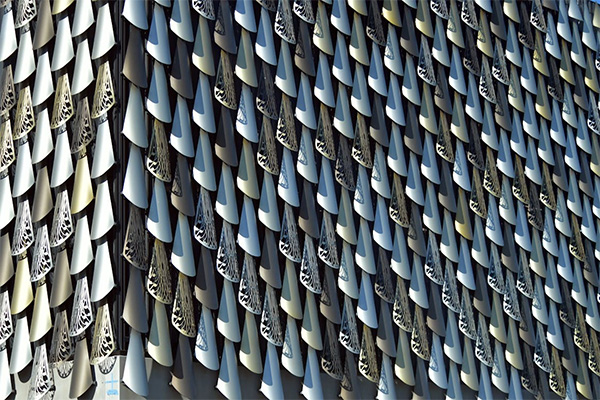
Color tells on a style faster than any textbook. Art Nouveau leans into soft, muted tones: moss greens, dusty lilacs, smoky blues, warm creams, and gentle browns. It favors materials that feel earthy or hand-touched: carved wood, stained glass, ceramic tiles, wrought iron that curls like vines. Art Deco walks in and demands the spotlight. Bold blacks, creams, deep reds, royal blues, gold, chrome, glossy lacquer. Surfaces shine. Edges gleam. Marble, exotic woods, mirrored glass, and metal inlays announce money and confidence. When a space glows like a jewelry box under stage lights, Deco usually runs the show. When it feels like a romantic garden at dusk, Nouveau quietly owns it.
Silhouettes, Space, and Mood
Even from a distance, shapes give the game away. Art Nouveau silhouettes stretch and melt. Doorways arch like plant stems. Stair rails sweep in long, fluid motions. Rooms feel intimate, almost secretive, with details that pull the eye along wandering paths. Art Deco prefers stacked, stepped shapes and clear outlines. Skyscrapers rise in setbacks. Interiors rely on strong horizontal bands and vertical thrusts. The mood shifts too. Nouveau feels dreamy, romantic, sometimes slightly melancholic, like an old poster in a Paris metro station. Deco charges forward with confidence and rhythm, closer to a jazz club or ocean liner. One style invites drifting; the other pushes everything forward.
Once the basic contrasts lock in, curves versus angles, nature versus machines, softness versus shine, the fog clears quickly. Street walks turn into small history lessons. That swirling balcony suddenly links to a whole era obsessed with plants and craftsmanship. That bold, stepped facade snaps into focus as a love letter to speed and skyscrapers. The important thing isn’t memorizing labels. It’s training the eye to notice lines, motifs, materials, and mood. With that habit in place, those two often-confused styles stop blending together and start arguing in public, right on the street, for anyone sharp enough to catch the difference.
Photo Attribution:
1st & featured image by https://www.pexels.com/photo/helsinki-central-station-art-deco-architecture-32978396/
2nd image by https://www.pexels.com/photo/fractals-on-building-17296734/
