
Twenty years ago, the color professionals at Pantone decided to introduce a color of the year. This decision was a risky one and they are fully aware of it. Aside from the fact that the cultural conversation was mostly ruled over by Y2K delusions, Pantone was not even a familiar name inside a household. Even Leatrice Eiseman, the executive director of Color Institute of Pantone can still remember their first few thoughts about the project, “People we ask on the street have no idea what our company was.” When asking about people’s reaction, she added “Yeah the soap? The baby shampoo?”
Color of the year 2020
But after two few decades ever since Cerulean Blue painted the new millennium, Pantone finally revealed the color of the year for 2020 which is Classic Blue – a timeless, tranquil tone of azure. Though the color choice of the company has been quite old-fashion in the previous years – cue in living coral in 2019 – introducing a familiar and trustworthy color perfectly embodies the uncertainty that the future has and a reinvention of the minimalist culture thru clean straightforward hues and designs. “Whenever we examine the world that we have, we can totally tell that we are living with tons of unrest. In fact, there are some days where we don’t feel like we have security,” Eiseman state. “According to a psychological perspective, blue has always been the perfect representation of reliability and calmness. It’s a hue that you can count on.”
Worldwide research
It is also a color that is familiar all over the globe. During Pantone’s worldwide research – one that starts one year in advance before the big announcement – Classic Blue stands out in the industries as comprehensive as the beauty world, art market, tech, automotive products, and even in the outer space. Accuracy was the main factor when Eiseman selected 2020’s color. It was guaranteed that it would be unique from the previous azure tones that were introduced before. “There is a massive selection of blues that you’ll find in the Pantone system; however, this distinct color truly have us that push of stability and confidence,” she explains.
Tradition and classic interior designs
The company’s insight was also suited to the gradual return of tradition and convention interior design and decorating styles. There’s something about blue that ties up different varieties of classic design genres covering American and chinoiserie. “I don’t actually think there’s anything wrong with it,” Eiseman notes of this comeback,” However, she also added, “We are making efforts to add a hint of a new twist, most especially to our fabrication.”
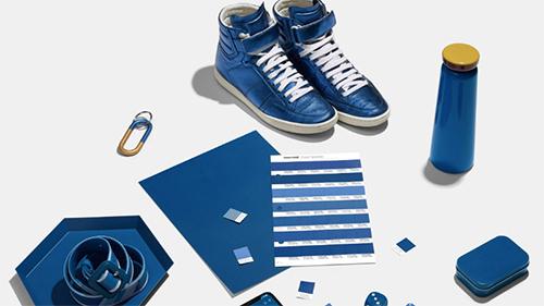
A new twist
As a way to intensify 2020 unveil, Pantone added their own twist: before its marketing campaign, they collaborated with different brands to create the sound, texture, taste, and smell of Classic Blue. The end result is made of a patch of suede-like fabric create by the Inside, a blue jelly with berry-flavour, a candle with musk-and-sea-salt aroma, and a three-minute audio track named “Vivid Nostalgia.” Eiseman is looking forward to inspiring other designers and consumers to see color in a different way for the upcoming year.I
Photo Attribution:
1st and featured image from https://www.insider.com/pantone-color-2020-classic-blue-interior-designer-2019-12
2nd image from https://www.gizmodo.co.uk/2019/12/colour-experts-declare-2020-blue/
