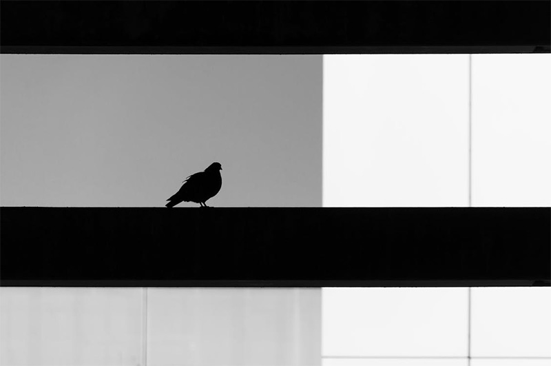
Negative space sounds like a scolding. It isn’t. It’s the quiet part of a design that does the heavy lifting, the silence that makes the melody make sense. Crowded pages shout. Sparse pages speak. That distinction matters because attention has turned into a scarce commodity, traded like oil. When everything tries to win, nothing wins. Negative space sets the rules of the room. It tells the eye where to land, how long to stay, and when to move on. Bad designers fear emptiness. Serious designers fear confusion. The gap, the margin, the pause. Tools, not accidents.
Silence That Directs the Eye
The eye behaves like a curious animal. It follows contrast, edges, and clusters. Negative space works as a fence and a path at the same time. Place a single object in a wide field of blank area and it gains authority. Not because it grew larger or gained color, but because nothing competes with it. Museums understand this. A small sculpture in a big white room feels important, even if it’s scrap metal. Editors know it too. A headline with breathing room looks confident. A headline crammed into a corner looks like it’s begging. What this truly signals is control.

The Physics of Readability
Reading isn’t just intellect. It’s mechanics. Lines need spacing or the eye trips, like a runner in a cluttered hallway. Paragraphs need margins or the page turns into a gray slab, the typographic version of a traffic jam. Negative space makes comprehension faster because it groups ideas into chunks the brain can swallow without choking. Consider a restaurant menu. When items crowd together, diners panic and default to the safe choice. When the menu gives each category room, diners explore. That isn’t decoration. That’s decision design. Clarity sells. Confusion taxes.
Brand Confidence, Not Brand Noise
Brands love to talk. Logos, slogans, badges, icons, little bursts of meaning that pile up like bumper stickers. Negative space forces a brand to choose. Choice creates character. Luxury brands learned this lesson early. They don’t scream. They pause. They let materials, typography, and proportion carry the message. A cheap brand often fills every corner because it fears being ignored. That fear shows. A confident identity can sit in the center of a page with room around it and still feel present. The blank area becomes a spotlight.
Architecture, Music, and the Pause
Design theory likes to pretend it lives only on screens and paper. That’s nonsense. Architecture runs on negative space. A courtyard matters as much as the walls around it. A doorway matters because of the solid that frames it. Music does the same trick. A rest creates tension. A pause makes rhythm human. Visual design borrows this logic. Space between elements creates tempo. Tight spacing feels frantic. Generous spacing feels calm, sometimes severe, sometimes elegant. Is negative space empty? Only to the impatient. It functions like punctuation.
Negative space doesn’t mean minimalism, and it certainly doesn’t mean laziness. It means intention. It means letting a message arrive without wrestling through clutter. Space clarifies hierarchy, improves reading, and signals confidence, all while reducing the cognitive bill that every viewer must pay. The modern world already stacks stimuli like junk mail. A good layout refuses to join the pile. The blank parts aren’t blank. They act. They guide. They set pace. They protect meaning from chaos. Anyone chasing clearer communication should start with a simple practice. Remove something. Then remove one more.
Photo Attribution:
1st & featured image by https://www.pexels.com/photo/silhouette-of-a-bird-on-urban-structure-35067273/
2nd image by https://www.pexels.com/photo/silhouette-of-person-with-dramatic-lighting-29736383/

