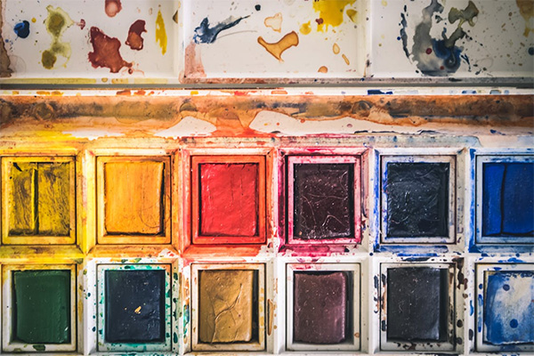
Color theory isn’t just academic; it’s a fundamental language for visual artists. It provides the framework for wielding hue to stir specific feelings and elicit viewer responses. Grasping the intricacies of color interactions, the gut reactions triggered by warm versus cool palettes, and the power of deliberate color harmonies lets painters sculpt compelling visual stories. Cultural color associations weave in extra layers of meaning, deepening how viewers engage with and understand a piece. This mastery over color goes beyond surface beauty. It unlocks profound emotional resonances.
The Basics of Color Theory
At its heart, color theory maps the relationships between colors. It structures the spectrum into primary, secondary, and tertiary hues, often visualized on a color wheel. This wheel isn’t just decorative; it reveals critical relationships. Look across the wheel: complementary colors clash, creating vibrant energy and visual pop. Look adjacent: analogous colors blend, fostering a sense of unity and calm. Key concepts like chroma (saturation), value (lightness/darkness), and color temperature are the artist’s levers. Pulling these levers manipulates the emotional tenor, guiding the viewer’s journey through the artwork.
The Psychological Impact of Warm and Cool Colors
Think fiery reds, vibrant oranges, sunny yellows. These warm colors practically radiate energy, heat, excitement. They pull the eye, generating feelings of passion, perhaps joy, creating an immediate, often welcoming presence. Now consider the other side: deep blues, verdant greens, mysterious purples. Cool colors recede. They foster calm, quiet contemplation, a touch of introspection. These hues might evoke serenity, but also a feeling of distance, a cool detachment. Artists strategically deploy these temperature zones. They shape the emotional landscape of their work, subtly directing the viewer towards the intended mood.
Using Color Harmonies to Create Balance and Contrast
Skilled artists orchestrate color harmonies to build structure and dynamism within a canvas. Combining colors based on their wheel positions—complementary, analogous, triadic—creates specific visual effects. Complementary pairings, for example, generate maximum contrast. Think simultaneous contrast, where colors intensify each other at their boundary. This can heighten drama, introduce tension. Analogous schemes, conversely, whisper unity, smoothing transitions and creating visual flow. Manipulating value and chroma within these harmonies adds another dimension. Artists can punch up focal points, carve out spatial depth, or flatten the picture plane. Understanding these harmonic structures is crucial for communicating complex feelings and narratives, making the work resonate and dynamic.
Symbolism and Cultural Meanings of Color in Art
Color speaks volumes, but its dialect changes across cultures. Red might scream passion or danger in one context, yet signify good fortune and celebration in another. White often reads as purity, innocence in Western traditions. Elsewhere, it’s the color of mourning, of transition. Artists conscious of these embedded meanings can layer their work with subtle, or overt, significance. The viewer interprets the piece filtered through their own cultural understanding. A deliberate color choice becomes a coded message, tapping into shared beliefs, collective memories, or specific cultural experiences. It adds richness.
Color theory provides indispensable tools. Artists harness the potent emotional charge of hue through calculated palette choices and harmonic arrangements. An understanding of color psychology—the push and pull of warm and cool—combined with an awareness of culturally ingrained symbolism allows for the creation of powerful visual narratives. Narratives designed to evoke precise emotional states. This skillful handling of color elevates a work beyond mere aesthetics. It forges a deeper, more resonant connection with the viewer, transforming looking into feeling.
Photo Attribution:
1st & featured image by https://www.pexels.com/photo/color-shade-samples-276267/
2nd image by https://www.pexels.com/photo/water-color-palette-on-white-case-933967/

