Every artist faces it: the moment when a painting just doesn’t pop, when something’s missing and no amount of shading or detail fixes the problem. Nine times out of ten, color is the culprit. It looks simple, red, blue, yellow, but there’s nothing simple about what happens when paint hits canvas. The real magic sits behind choices no one sees: why orange vibrates next to blue, or how a dash of gray can make everything sing. To get past this invisible barrier, artists need more than talent; they need to decode what’s hiding in plain sight.
The Secret Language of Color Wheels
First thought: color wheels are elementary school stuff. Not so fast. That little wheel holds every key an artist needs, harmony, contrast, and those accidental disasters that muddy up a piece. Complementary pairs? They do more than clash, they spark energy on the canvas. Analogous colors? Soft transitions that whisper instead of shout. Triads pull balance from chaos. Some ignore all this and hope for the best; most regret it later. Mastery starts with respecting these spinning relationships and understanding where hue placement leads to tension or peace.
Temperature: More Than Hot and Cold
Warm versus cool isn’t just marketing speak for sweaters and refrigerators, it’s central to believable art. Warm colors (think reds, yellows) naturally advance toward viewers, practically leaping off the surface; cool hues (blues, greens) slink into shadows and background space without fuss. Mix too much warmth? The image flattens out like wilted lettuce forgotten in the fridge drawer. All cools? Suddenly everything’s sterile, a hospital waiting room on a Monday morning. What really pushes skill forward is learning how temperature guides mood, depth, even storytelling in every composition.
Value Trumps Hue Every Time
Some chase vibrant pigments like crows after shiny things, missing the dirty secret among pros: value always wins out over hue itself. Lights against darks build drama; subtle mid-tones ground an image without shouting for attention. Try painting in grayscale sometime, just black to white, and suddenly structure appears crystal clear where muddled rainbows once reigned supreme. It isn’t about ignoring color; it’s about wielding lightness and darkness first so color becomes icing on cake rather than messy camouflage for weak design.
Mixing Without Mud
This is where frustration lives, in muddled greens that look like pond water or sickly pinks nobody wants on their portrait subject’s face. Yet clean mixing is less mystery than discipline: limit palette choices up front before brush ever touches surface; mix complements sparingly since they neutralize each other fast; test every blend before committing it to the main event. Precision beats luck here every single time, the disciplined hand walks away with clarity while guesswork leaves only disappointment and murkiness in its place.
Mastery doesn’t require rare genius, just awareness sharpened by trial, error, observation… repeat as needed until intuition grows sharper than habit alone could ever provide. So forget the myth of the born genius; color mastery is a craft, not a gift. It’s built on the deliberate work of understanding the relationships on the color wheel, wielding temperature to create space, and respecting the fundamental truth that value does the heavy lifting every single time. This isn’t about memorizing rules, it’s about internalizing a code—a practical language of light, dark, warmth, and coolness that, once learned, transforms frustrating guesswork into confident, intuitive creation, proving that the most vibrant results come not from luck, but from discipline.
Photo Attribution:
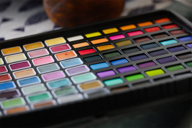
1st & featured image by https://www.pexels.com/photo/colorful-watercolor-palette-for-artistic-creations-33727310/
2nd image by https://www.pexels.com/photo/water-bubbles-220989/

