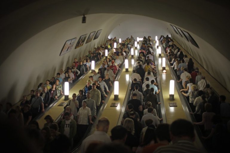
Once in a while, it is good to make efforts to conserve history. For years, Moscow’s metro station has kept its Stalin-era designs that will remind you of palaces. But now it seems that Moscow has grown tired of tradition and is looking to break free from all of that.
Moscow Station Face-Lift
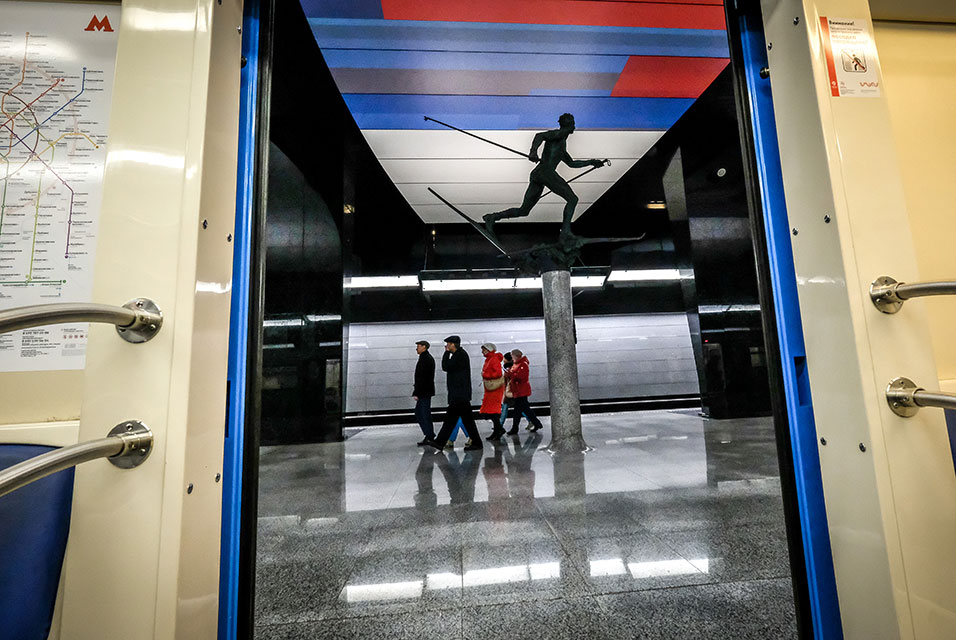
Attempting to step away from tradition, Moscow’s city government has hired architects in their efforts to finally give their stations a more modern look. They even made a phone app available for people to vote which designs they would like to see for each station. And instead of the traditional “palaces for the people” style, commuters will get to see new designs that are full of metal, plastic, and glass.
This isn’t just some renovation intended for the Moscow stations. Moscow has been planning and started an expansion project of their underground stations and these new designs are part of the project that’s scheduled to end at 2020, with many of the renovated stations to open starting this year. Moscow’s Nefa Architects are the one who are leading the renovations, as well as the designs for the expansions.
Nina Frolova, an architecture journalist, comments on how “interesting and original” the planned stations are outside of the traditional style. Dmitry Ovcharov, the lead architect of Nefa, commented on how they want the designs to let sunlight into the stations so they created holes in the station walls. They also added cylindrical white light boxes that are strong enough become seats for waiting passengers.
Other architects and architect teams are working on other stations. Each station will have their own design based on who’s design is liked by the people most, though they were told to create modern designs while keeping in mind that the designs are going to be implemented using Russian materials and should have minimal decorations.
It seems that Moscow is aiming for that professional and modern look without looking too gaudy. Though they had these limitations in mind, architects all over Russia took up the challenge and saw this as an opportunity to make a name for themselves.
Ugly Seams
Still it seems that there are a few mishaps here and there, like the big changes that were needed to be done in the Novoperedelkino Station’s design or overhead lights that doesn’t work at the Solntsevo Station. It seems that quality is also an attribute the architects had to struggle with.
Which is telling considering that the Moscow Metro was built with the highest quality that the old Soviet Union can provide. It stands as a symbol of the grandeur of Russia’s past under the rule of Stalin, and contains some of Moscow’s decorative art. Also, the metro was supposed to be able to serve as a bunker during wartime. The architects have to match the quality of the old stations, which has stood since 1930.
Monopoly
The Metrogiprotrans state company is the one that usually handles the architecture of the transport system and almost all of the designs for the stations. One of its talented architects, Alexander Orlov, argues that only they have the expertise when it come to Moscow’s transport system, and they too have been planning to modernize the stations’ design.
Many more stations are planned to be renovated or created as the expansion continues and Moscow claims that the project is ahead of their planned 2020 deadline. Ovcharov already plans to enter another competition for the design of another station. Konstantin Khudyakov, a digital artist who worked for Metrogiprotrans on the Fonvizinskaya station, hopes that the stations will continue to be a showcase of art just as they did before. He comments about Moscow’s lack of art galleries: “There’s not enough art. People are deprived of art.”
!st Image: Old Moscow Station, via citylab.com
2nd Image: New Moscow Station look, via artdaily.com

