
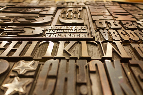
Designers want to perceive themselves as a pro in what they do. Creating projects with gorgeous typography is one clever way to look like an expert every single time. This article will explore the art and language of typography and everything in between. It’s an incredible guide for newbies and a refreshing new course for experienced designers. No matter which kind of designer you are, knowing the language of typography – from communicating with the staff and mixing and matching fonts – is an essential aspect of designing.
1. Common fonts can lead to user confusion
Keedy Sans is a popular font that is developed by Mr. Keedy around the 1990s. Ten years later, the font was everywhere, and it was uncool. It was utilized on almost everything – from wine bars to packaging for teenage makeup. This could lead to negative user experience due to inadequate branding. To stop this endemic, Mr. Keedy updated his font to provide high customization and let Keedy enthusiasts design the fonts for unique visual effects.
2. Emojis should be consistent
Basically, emojis are pictures that have different meanings in different devices. Take it from Jennifer Daniel, the founder of Google Emoji, who said that the “dumpling” emoji have different looks in various chat platforms. This makes sense since each culture has their own version of a dumpling. However, emojis need to have a consistent look for all platforms but can still be customized to their users.
3. Braille is considered as a form of typography
Blind people read Braille in a very unique method. They hold it across their body to feel the bulging dot symbols. These carefully curated symbols are unique, and they are recognizable by blind individuals. They use their sense of touch to be able to read. They can also watch music videos through the accessibility voiceover.
4. Content and design go hand in hand with branding
According to Gale Bichler from New York Times, the publication branded itself as a company that experiments with various kinds of fonts. They mix and match a wide variety of fonts and use them as an illustration. They also make it a point to create a sense of individualism when presenting their newspaper to the public. For instance, if you see a page of their newspaper, you’ll instantly know that it came from the New York Times – that’s the beauty of branding.
5. Choosing fonts is like having an ice cream
When you mix fonts, examine its organic and mechanic feel. According to Veronika Burian and Jose Scaglione of Type-Together, most people dig humanist’s fonts, those with a touch of a calligrapher’s hand.
Basically, you should look for balance typefaces that have the same language. Typography is an essential tool in the field of design and branding, and it is used in many mediums all across the world. There are visual languages such as audio caption, Braille, and symbols. The challenge is how you can create something that offers fresh and pleasant experiences for these latest forms of language.
Photo Attribution:
1st and Featured image from https://pixabay.com/photos/hands-writting-invitation-typography-2110452/
2nd image from https://pixabay.com/photos/printing-plate-letters-font-type-1030849/
