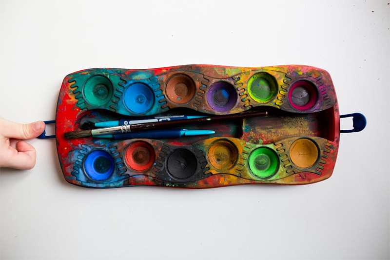
Color intimidates beginners more than any blank canvas ever did. The problem usually isn’t talent, it’s confusion. Too many tubes, strange terms, and muddy disasters on the palette. The good news: color follows rules. Once those rules click, mixing stops feeling like guesswork and starts to feel predictable, even a little addictive. Think of it as learning scales before improvising. Yes, there’s theory. Yes, it matters. But it’s not mystical. With a few core ideas, a simple set of paints, and some discipline, anyone can build clean, vibrant mixes instead of brown sludge.
Primary Colors, Simplified
Color systems confuse people because different fields use different “primaries.” Printers use cyan, magenta, and yellow. Screens use red, green, and blue. Paint behaves differently. For beginners working with paint, the most practical set leans toward cyan, magenta, and yellow, but most brands label them as cool blue, cool red, and a strong lemon or primary yellow. Those three, plus white, build a flexible base. Red, yellow, and blue still show up in books, but that old trio tends to mix dull oranges, greens, and purples. The inescapable conclusion: start with modern primaries. They give cleaner, brighter mixes and teach control faster.
Warm and Cool: Why the Same Color Acts Different
Every primary leans warm or cool. That simple fact explains half the frustration beginners feel. A warm red leans toward orange, a cool red leans toward violet. Same story with blues and yellows. When a painter tries to mix a bright green with a warm, orangey yellow and a warm, purplish blue, the result turns grayish. Those hidden opposites cancel each other. Use a cool yellow and a cool, greenish blue instead, and the green suddenly snaps to life. The smart habit: keep two versions of each primary, one warm, one cool, and choose the pair that “points” toward the target color.
Avoiding Mud: The Discipline of Limiting Colors
Most muddy color doesn’t come from “bad paint.” It comes from mixing too many colors at once. Three pigments already start to dull a mixture. Four or five, and everything sinks into the same tired brown. Strong painters often look like they use many colors, but they usually mix each passage from just two, sometimes three, pigments. That keeps clarity. A simple practice changes everything: before mixing, decide which two colors will do the heavy lifting, then only tweak slightly with a third if needed. Test small piles on the palette. Once a mix starts to die, stop. Scrape it, reset, and mix fresh.
Light, Dark, and the Power of Neutrals
Beginners obsess over hue, red versus blue, while value and saturation quietly run the show. A dull, grayish color in the right lightness can look more sophisticated than a screaming bright one. Neutral colors come from mixing complements, colors opposite on the color wheel, like blue and orange or red and green. Push the orange a bit more, it warms. Add extra blue, it cools. Those neutrals shape shadows, skin tones, and natural scenes. White doesn’t just lighten; it also cools and chalks a color. Better strategy: lighten with a near neighbor plus a little white, darken with its complement, and save pure white for the strongest highlights.
Color mixing rewards patience, not guesswork. A basic set of modern primaries, an understanding of warm and cool bias, and strict limits on how many pigments go into any one mix form a strong foundation. From there, neutrals and value control turn flat color into convincing light and depth. None of this belongs to a special few with a “gift for color.” It belongs to anyone willing to test small, take notes, and repeat successful mixes. Over time, the palette stops feeling like chaos and starts to behave like a clear, reliable tool.
Photo Attribution:
1st & featured image by https://www.pexels.com/photo/wood-art-painting-colorful-2027047/
2nd image by https://www.pexels.com/photo/woman-hand-with-red-fabric-on-white-background-8746755/

